The USDA today released a much-needed overhaul of the Food Pyramid, which for a couple of decades has tried to graphically show us how to eat in a healthy way.
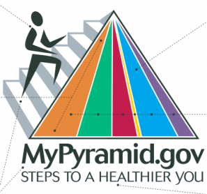
As someone who’s spent her professional life evaluating the effectiveness of graphic images, I can say that this is a huge improvement over the original Food Pyramid, which dates back to my elementary school days—and an even bigger leap from the awful “MyPyramid” that was issued in 2005.
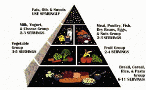
At least the older version, at right, graphically represented the different food groups, and the hierarchy helped explain the prominence each food should take in a daily diet. The 2005 MyPyramid, which attempted to loop in the idea of exercise as part of a healthy lifestyle, was a fiasco of infographics, rendering the information completely undecipherable without accompanying text. Who knows what those colors mean, and how much of each group we should really be consuming? What are we supposed to glean from that gold sliver of the pyramid?
The new MyPlate shows at a glance how our dinner plate should be composed. The plate concept is quite smart—it was always impossible to translate the theoretical pyramid scheme into the reality of what we actually eat every day. Simple labels take the place of the cute illustrations. (Lore has it that industry groups lobbied hard over the size, placement and representation of their products in the illustrated graphics.)
Too, the new graphic is refreshingly free of politics—at least, any overt sign of politics. The USDA’s dietary guidelines are fraught with special interests, as lobbyists fight to tone down warnings against certain foods and ingredients in favor of healthier choices. Hence, the recommendation to increase intake of fat-free milk, rather than reducing dairy consumption overall.
While my designer friends may quibble over typography, as an advocate for eating simply and sensibly, I think this new image is both: simple and sensible.
What do you think? Please feel free to comment below!
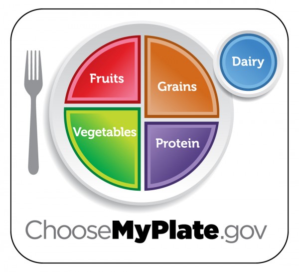





I like the plate concept and graphic. It looks more balanced – which is how our diet should be! People still might not grasp the amount of fruits and vegetables that are needed based on this graphic. Load up on the fruits and veggies – meat, dairy and grains are the side dish.
No doubt it’s a huge improvement, but I would’ve voted for more specificity through adjectives: whole grains, lean protein, fresh fruits, colorful (or fresh or raw) vegetables.
I do think they went in the right direction with a plate icon. As Marion Nestle points out, people eat off of plates, not pyramids. As a kid I could never figure out the pyramid. Sure, the base is bigger, but isn’t the food at the top the best, because it’s, you know, at the top? It was a mystery.
People are visual creatures. Putting it on a plate makes much more sense. Of course, a friend joked, “How much of the fast food bag should contain fried potatoes?” It’s a start, anyway.
I do like that it’s downplaying grains and starches. I’m a carb addict, but even I know that a pyramid built on bread, cereal, rice and pasta isn’t the right way to go (even if it is delicious!)
So, how long before someone starts marketing plates that look like this?